
Hello and Welcome.
Last week I decided to do separate cards for the 3 challenges I try to participate in.
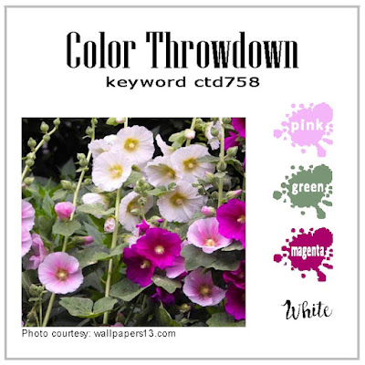
This card is for the Color Throwdown #758
Below is the card that I came up with for the challenge.

Anyway...Card Details:
Card Base - Berry Burst. Punched Border is Bubble Bath and Garden Green (SU)
Basic White and a piece of very old designer paper (source unknown) from my stash.
Image colored with Pencils. I used an old SU stamp set, (Sassy Stems - retired). The sentiment is from an old Hero Arts set, (Stencil Prints) I also used the retired SU Itty Bitty Backgrounds and some Bubble Bath ink to stamp around the main flower image.
Memento Tuxedo Black ink was used for the image/sentiment.
Punch is from Martha Stewart.
I added some Magenta pearls to the flowers - Source unknown.
That's it for this weeks Throwdown. - Don't forget to stop in and check out the Design Teams cards & participants. Lots of great inspiration.
Love that sweet floral with the cherry background! Great use of the colors!! Thanks for playing along at the Color Throwdown this week!
ReplyDeleteVery nice. I love the color combination. That designer paper is really cute with those little gingham squares. I sometimes have trouble taking pictures of my cards too. I always try to take them next to a window but on gray days that doesn't always help
ReplyDeleteits beautiful and I have those colors everywhere in my house, each room. even the pillows on the front porch bench are exactly the colors of the card
ReplyDeleteFirst thing I thought the stamp looked familiar. It's so cute! I love the oldies. Cute paper, too. I've been looking a lot at my older stamps recently. Drawers of really wonderful things. Your sweet card is inspiring, Ida!
ReplyDelete