WELCOME

Welcome to my blog.

If you came here expecting to see Photography Photos you will need to visit my PHOTOGRAPHY BLOG at:

Thank you for stopping by & visiting. I appreciate you interest and your comments. Have a great day.

Sep 29, 2023

FMS#605 and Inspired By Pumpkins


 Welcome! - Fall is in the air here and I just love what the season brings.  Today I'm joining in on a couple of challenges with my card.  

Here is the sketch:

 and the Inspiration Board, (Which there was also a sketch there - that I did not use)

I guess for my card I was mainly inspired by Pumpkins!

Plus I had already decided on the sketch from FMS so hopefully this will be okay to post for both challenges.


Here is the card that I made for these challenges: Click to enlarge

Details:  Stamps:  Pumpkin and Sentiment are from Unity Sept. 2023 KOM (Harvest Hues) - Background Stamp, Sanded*retired SU.
Card Stock:  Cajun Craze, Tangerine Tango*retired and Basic White
Ink: Memento Tuxedo Black,  Versamark Ink.
Designer Paper: DCWV Pumpkin Patch (2022)
Coloring Medium - Watercolor Pencils and a Blending Pen
Other: Punch - EK Success and Sequins (Hobby Lobby)  I also used a Wink of Stella Pen on the mug for some shimmer. 
 
That's it for this card.  I hope you enjoyed seeing what I created and will stop by the links to view the other entries and see what the Design Teams came up with as well.  


Sep 24, 2023

Color Throwdown #761

 
 Welcome!
 
Joining this weeks Color Throwdown #761 
 
I really liked this color combo.
 
Below is the card that I created for this challenge:


Details:  Card Stock Used:  Night of Navy, Tangerine Tango*retired,
More Mustard* retired and Basic White.
Stamps - Unity September KOM (Harvest Hues)
Ink: Night of Navy, More Mustard*, Memento Tuxedo Black
Designer Paper: We Are Memory Keepers (Maple Grove)
Enamel Dots: Paper Studio
Colored Pencils (Prisma) blended with Gamsol
Foam Tape.
 
Hope you have enjoyed how I used these fun colors.

Sep 18, 2023

Color Throwdown #760 and Freshly Made Sketches#603

 
 Welcome.  

Today I'm sharing 2 different cards.  One is for,

FMS#603  and the other is for CTD #760 - The links will be below:
 
First up for the Color Throwdown #760
 
You can click on images to make them larger.
 
Here is the card that I came up with for this color challenge:
 
I used an old card idea from 2009: We did this card at my stamp club back when I was a Demonstrator for Stampin'Up!

 Here is the updated version using the colors from the throwdown:


Details:  Stamp Set: Fifth Avenue Floral (Retired SU)                   Card Stock: Night of Navy, Balmy Blue, Daffodil Delight and Basic White. Designer Paper bought at JoAnn's.  Ink Pads: Night of Navy, Balmy Blue, Daffodil Delight.  Other: Buttercup Liquid Pearls, Foam Tape, Balmy Blue marker spritz on.

---------------------------------------------------------------------------------

Freshly Made Sketches #603 

 Here is my card for this challenge:


Card Details: Stamps: Unity (Gnome-o-ween) and SU (Halloween Backgrounds*retired.  Card stock:  Basic Black, Basic White, Only Orange*retiredSU, Granny Apple Green.  Ink: Memento Tuxedo Black, Granny Apple Green. - Other: Colored Pencils, Gamsol, Glitter, Designer Paper (DCWV).

I had a lot of fun with this card.  Normally I'm not a fan of "Gnomes" but these little Halloween Guys made me smile.  I did veer slightly from the sketch to fit my sentiment in.

Sep 9, 2023

"Two fer" card challenge: FMS & CTD


Hello and Welcome!
 
Today I'm featuring 2 different cards.  One is for the Color Throwdown and the other is for Freshly Made sketches.
 
Here's where the "Two-fer" part comes in.  I used the same sketch for both cards.

 Freshly Made Sketches #602

Below is the card that I made for FMS#602


For this card I used a stamp set that I got last year, Hocus Pocus from Photo play.  You can see a couple of the cards I made here and here and here.  (You can check out the links for extra inspiration using that set if you want.)

Card Base: Basic Black, next layer, Only Orange (retired SU) that I stamped the little star image from the set with Only Orange ink.

I added a piece of plaid designer paper (DCWV - Spooky Time) and a piece of purple card stock to the left side.  Image was colored with pencils.  Added some punched bats from the set and some purple sequins to complete the card.

COLOR THROWDOWN#759

This weeks color choices were:

Here is the card I made for this challenge.  - It uses the same sketch as the card above.


This one was "tough" for me. - Card base: Cherry Cobble (for the maroon in the color scheme). Next layer, Only Orange (retired SU) that I embossed with a leaf embossing folder and then brushed metallic Gold ink on.

I stamped some of the leaves (retired SU set, Autumn Leaf Prints) and then water colored them using retired SU watercolor pencils and  water brush.  After it dried I used a different leaf stamp from the same set and Versamark ink and then embossed with Detail Gold embossing powder.  I also used the SU Itty Bitty Background set (retired SU) and some Real Red and Only Orange ink to add some splatters.  The sentiment is from, Stamp Rose.  To finish the card I added some orange baker's twine.

That's it for these two challenges.  I hope you have enjoyed your visit.


Sep 7, 2023

Dam Good Day - PP656 and DoubleD Fall Plaids

 Hello and Welcome!

Had some fun today creating this little card for the Paper Players and Double D Challenges


Also being entered for Double D - Fall Plaids 


These are the inspiration mood boards for the challenges.


Here is the card that I created for them: Click to enlarge images.
 

For this card I started with this adorable beaver image from Unity Stamps, (Witty Wild Ones) stamp set.  I colored it with Prisma Colored Pencils blended with Gamsol on Basic White card stock.
 
The image was cut out with a circle die from SU Stylish Dies as was the outer circle.
 
I used a paper from a Park Lane Collection, (Golden Hour) for the various patterned papers on the card.
 
Card Base - Piece of heavy white card stock
Layered with Blackberry Bliss (SU) which appears to almost look black in the photo but it's actually a very deep purplish color.
 
The sentiment (which I think is hilarious) and the Beaver were both stamped with Memento Tuxedo Black ink.  I used some Fishtail Dies and some sequins to complete the card.  Also the image/sentiment were raised up with foam tape.
 
Thanks for stopping by.  I hope you have enjoyed your visit.  Be sure to stop by the DT and check out their inspirational cards and also those who have joined in one the challenges.  Lots of great stuff.

Sep 6, 2023

Hello Friend


Welcome! Today's card started out to be a card I made for the Paper Players Color Challenge #653  - It never made it into the challenge since my computer was acting up that day and by the time I got the card edited it was to late to enter (bummer).


 I wanted to share the card anyway so here is the card that I made:


 I started out by stamping the pumpkin/flower image (Unity - August KOM - Phases) in Memento Tuxedo Black ink and colored it with Prisma Colored Pencils blended with Gamsol.

I cut the image out with a circle die from SU (Stylish) Dies. I added a circle of Melon Mambo (closest I had to Sweet Sorbet) with a Nestabilitie circle Die.  I offset the two circles.

The card base is, Blackberry Bliss. - I then embossed a layer of Calypso Coral with a Pumpkin Embossing Folder (Cuttlebug - Provo Craft ) I added a Fishtail piece of Daffodil Delight and the sentiment was from (Unity - February 2023 KOM - Happy Soul).

Some colored gems were added to 3 of the flowers on the pumpkin to complete the card.


Before I go I wanted to share that my card for PP655 Sketch Challenge was chosen as the "Headliner" for that week.  What a fun surprise that was.


Thanks for stopping by and enjoy the rest of the week.


Sep 4, 2023

Color Throwdown #758

 
 Hello and Welcome.

Last week I decided to do separate cards for the 3 challenges I try to participate in.

This card is for the Color Throwdown #758


Below is the card that I came up with for the challenge.
 
I had a hard time with this color combo for some reason.  Plus this shot makes the white look a bit yellowish.  It's hard to photograph sometimes with the lighting in our house. Plus I'm using a new editing program that I'm not totally familiar with.

Anyway...Card Details:
Card Base - Berry Burst. Punched Border is Bubble Bath  and Garden Green (SU)
Basic White and a piece of very old designer paper (source unknown) from my stash.

Image colored with Pencils.  I used an old SU stamp set, (Sassy Stems - retired).  The sentiment is from an old Hero Arts set, (Stencil Prints) I also used the retired SU Itty Bitty Backgrounds and some Bubble Bath ink to stamp around the main flower image.

Memento Tuxedo Black ink was used for the image/sentiment.
Punch is from Martha Stewart.
I added some Magenta pearls to the flowers - Source unknown.

That's it for this weeks Throwdown. - Don't forget to stop in and check out the Design Teams cards & participants.  Lots of great inspiration.


Aug 31, 2023

Freshly Made Sketches #601 (Spooky Spirits) and NBUS#53

Welcome back! 
Well it's time for a new sketch over on Freshly Made Sketches.  They just celebrated sketch #600 and now it's on to FMS#601 
 
Here is the card that I created for this sketch selected by Design Team member, Linda Callahan.
 
Since I'm using brand new stuff this is also going in for NBUS#53
 
Card Details - Stamp Set - Unity (Spooky Spirits) which is brand new.
Card Stock: Gorgeous Grape, Lemon Lime Twist, and Tangerine Tango*retired SU
Also Basic White for the image.
Designer Paper - Piece of Basic Grey - Eerie Paper Pad. I also used (for the first time) a piece of Washi Tape with "eye balls" on it that I've had in my stash for some time waiting for the right card.
 
I emobssed the Lemon Lime Twist cs with a Spiderweb Embossing Folder.  Added the designer paper and washi tape.
 
The images were stamped with Memento Tuxedo ink and colored with Prismacolor Pencils. They were cut out with Nestabilite dies. The edge was distressed with Gorgeous Grape ink. I added some Key Lime Glitter (Art Institute) to the rim of the cocktail glass.  The panel was mounted with foam tape and some sequins (Picket Fence Studio) were added to complete the card.
 
Here is a picture of the inside of the card:  The sentiment is actually all one piece : (I see you. You deserve a cocktail.) so I just inked up a portion of it for the front of the card and also the inside by masking off the portions I didn't want to use and then removing the masking tape before stamping down. - Hence the alignment on the outside of the card is a little off (but I wasn't about to recolor another entire piece).

That's it for today. - I hope you've enjoyed your visit.  Don't forget to check out the Design Teams cards & maybe participate yourself!


Aug 29, 2023

Paper Players Sketch Challenge #655


Before I get started on today's card I wanted to post a, Thank You for being chosen as one of the, CUT ABOVE for this card a couple of weeks ago. It's always an honor when you get chosen.

Now let's move on to this weeks Paper Players Challenge #655 which is a Sketch Challenge.  LeAnne was the design team member this for this weeks challenge and she chose a fun sketch with many possibilities for creativity.  


Here is what I came up with for my card:


I started with a card base of Basic Black card stock.  Next I found a piece of patterned paper, (DCWV - Halloween Town) - I remembered that I had a rubber stamp of some, Jail Birds from a Inkadinkado Stamp set that reminded me of the paper patterned.

I stamped the birds on Basic White card stock and colored them with pencils.  I added some Key Lime glitter (Art Institute) on their eyes for added sparkle.  I stamped the sentiment from the same stamp set with Memento Tuxedo black ink on a piece of Tangerine Tango* retired SU card stock.  It was cut out with a Stylish Die from SU and mounted on a black piece of card stock cut out with a Nestability die.  I mounted the birds with some foam tape for dimension and added some sequins (Picket Fence Studios) to complete the card.  The little strip is the same piece of patterned paper just cut differently.

I kept this one pretty CAS but I think it's a rather fun little Halloween card and hope you do as well.


Aug 25, 2023

3 in One Challenge

 Had to hurry to get this in under the wire:  PP654

Our computer periodically acts up (today was one of those days) and I barely got this posted in time to meet the deadline.


The first challenge was for the Paper Player CAS - Don't Bug Me #PP654.


 Then Freshly Made Sketches is celebrating their 600th sketch challenge this week. - That is amazing & wonderful.

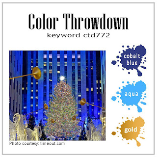
Finally the Color Throwdown colors were: Grey, Aqua and Green.  - Here is what I created for these three challenges combined in this one card.


My card for Paper Players, Freshly Made Sketches and Color Throwdown.


Details will follow soon.   - Card Base, Basic Gray, Pool Party (I almost typed Poop party)....

Next a piece of unknown origin designer paper that was white, aqua and had hints of green.  I used a punched border of Lemon Lime Twist. - The punch is from, EK Success.

The butterfly (Stampendous - Winged Cup stamp set) and was stamped with Memento Tuxedo black ink and colored with pencils.  I also used a butterfly stamp from a retired SU set, Beyond the Basics.  I stamped it on the circle with the Lemon Lime Ink and on the Pool party piece with Pool Party ink.  Added a piece of Bakers Twine, Some Enamel Dots (Paper Studio) - The sentiment was stamped in Basic Gray ink and punched with a retired SU punch.  The sentiment is from Amuse Studio.

Aug 18, 2023

CTD, FMS & NBUS Challenges

 Did you ever have an idea for a card in your head and try to create it to fit that image? - Well that's exactly what happened when I saw this weeks Color Throwdown#756 and the sketch from Freshly Made Sketches#599

I wanted to combine the two challenges and also use some new stamps from this months KOM from Unity (Phases) so this will also be entered for NBUS#53


 Here is what I came up with for these two challenges.


This was a card of (trial and error) as I stamped several of the image trying to figure out just how I wanted it to look.

Card Details:  Card Base: Mossy Meadow (SU) Orange layer is Tangerine Tango (*retired SU - Oh how I miss that orange)
Designer Paper is from an old Basic Grey pad I've had for years and just found a piece of that fit the colors in the throwdown challenge.

Next I used a piece of Early Espresso (SU) and a Martha Stewart Punch to create the drip.  That was sprayed with some Distressed Bronze Mica Spray (Tim Holtz - Ranger)

I then made a tag with Crumb Cake (Kraft - SU) card stock and blended some Espresso Ink around the edges.  I stamped the background  image from the KOM with the Early Espresso Ink.  Then I used my Versa Mark pad and stamped the Witch Image and embossed her with Terra Cotta Tapestry embossing Powder (Personal Stamp Exchange - which I believe is no longer in business.)

I stamped the sentiment (Boo and Stuff) also in the KOM with Early Espresso Ink and used some clear Embossing Powder on it.  That was layered on top of the Witch with foam tape and the tag was also mounted with foam tape.  The ribbon was a piece of *retired SU Chocolate Grosgrain that I pulled loose and looped through the tag so it has a frayed look.  I also brushed the Espresso Ink over it to darken it up a little.

Finally I added some sequins from Picket Fence Studio (Witches Brew) to complete the card. - I was super happy with how this turned out.

This shows a little of the detail of the embossing powder and the Mica Spray:


Aug 13, 2023

Color Throwdown #755 - Card2

 I liked the colors in the CTD#755 challenge so much that I played around and created a second card for the challenge.  This was the first card I posted: (Click for larger view)


Here is my second card:
I went a totally different direction on this card.  I happened to spot some patterned paper in my stash and thought it would make a fun Christmas card with some not so traditional colors and patterns.
Card Base: Real Red, Basic White Layer, Patterned Paper is from DCWV-Basics and Brights.  I used the red piece because the patterned reminded me of poinsettias.  Then I got out my Waffle Flower Poinsettia die and cut of 2 in red and one in white.  I layered the patterned paper on a circle of Granny Apple Green cs and die cut some leaves in the same paper.  The leaves are from another company.  Next I added a distressed piece of Summer Sun* (retired SU) card stock and a piece of patterned paper in a yellow tone.
I embossed the sentiment (Brightest Glow - SU) with Bold Black embossing powder.  I finished off the card with some sequins and added some yellow glitter to the center of the poinsettia berries.
Another CAS design and my very first Christmas card of the year!
 

Aug 11, 2023

Color Throwdown #755 and NBUS#53

 Today I'm sharing a card I created for this weeks Color Throwdown Challenge #755.
 
The colors are so fun!

Here is the card I created for the challenge:


How cute is that little Chameleon! - I found this set at the Dollar store (although now you pay, 1.25).  - It had 18 stamps in the set.  You can't go wrong with a bargain like that.  I worried that they might now be very high quality stamps but I didn't have any problems with them.
 
Also going in for NBUS#53 since it's a brand new set.

I started with a card base of Granny Apple Green.  Then a layer of Basic White.  I added a strip of Real Red cs that I stamped the paint brush and paint roller images on with Real Red ink.  The chameleon was stamped with Memento Tuxedo black ink and colored with various colored pencils.  I layered that to a piece of Summer Sun* (retired SU) card stock.  I used the Stylish Dies (SU) for the circle the chameleon was on and a Nestability die for the summer sun circle.  I mounted that with foam tape.  The sentiment was stamped in the same black ink and mounted on a piece of the summer sun cs.  To finish the card off I added some green enamel dots (Paper Studio).

Click on the image to enlarge and I hope you can see the images on the red piece a bit better.
 
 
 Grab our badge to display on your blog.
 
Have a wonderful day and thanks for stopping by.

Aug 8, 2023

Beautiful Summer - Paper Player Theme Challenge #652 and NBUS#53


Welcome. 

 Sometimes I'm a "day late and a dollar short" as they say on the challenges.  This card was supposed to go in for one of the Freshly Made sketches a couple of weeks ago. - Trouble was I couldn't seem to finish it in a way that I thought looked good so it's sat on my desk until today.  I finally finished it and am entering for The Paper Players Theme Challenge.

Here is the sketch (FMS#596) - Note this is just so you can see where I got my inspiration from as it's way to late to enter it for the sketch challenge.

Here is the mood board for The Paper Players PP652 


Here is the card I made:


 So for this card I used one of the Mermaid tales from the Unity July KOM along with the Seagulls, Wave & Sentiment from the same kit.  Since these are being used for the first time they will also go in for NBUS#53


So for this card my card base is: Blueberry Bushel (SU) my first time using this color (I like it).  Then I stamped the way image on a piece of Basis White cs with Blueberry Bushel ink and colored it in with a Copic marker.  I also stamped some dots (retired SU Itty Bitty Backgrounds) with Pretty Peacock ink randomly on the wave image.  Next the Mermaid tail was stamped with Memento Tuxedo black ink and colored with Copic Markers and fussy cut.  I then pressed the image onto a Versa Mark pad and embossed with Iridescent Ice EP (which I believe is retired SU) - You can see in the 2nd shot how shimmery it is.  I mounted it with foam tape after stamping the seagulls with black ink.  The sentiment was stamped with MTB ink and mounted on a piece of Pool Party cs.  To complete the card I added some enamel dots (Paper Studio).

Hope you enjoy this card.  It's a CAS card again and I'm actually starting to get the hang of them I think.